
At the heart of our renewed identity is the unmistakable silhouette of the dome of Church of the Little Flower.
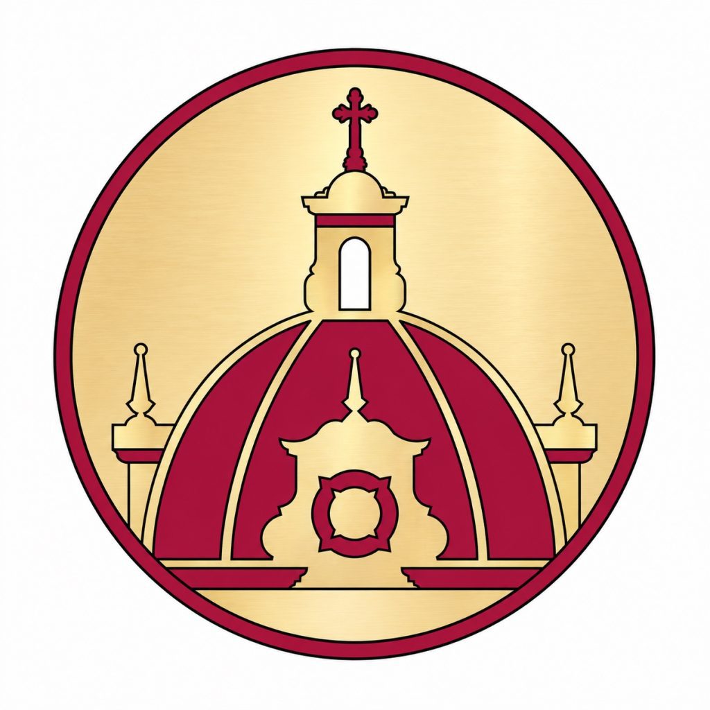
For generations, our dome has stood as one of the most recognizable features of our church, a familiar landmark to those who pass by and a beloved sign of home to those who worship here.
Its architecture tells our story. Rising toward heaven, the dome draws our eyes upward. Its stained-glass windows visually proclaim the Gospel to the world. Its bells audibly remind us of God’s enduring presence in our lives. The cross of Christ stands prominently above it all, enthroned atop the cupola. Together, these elements offer more than beauty; they serve as a visible reminder of the Christian life and of our call to live as missionary disciples.
We now embrace this defining feature as our new brand mark. Simple, timeless, and unmistakably ours, the mark honors the beauty and history of our parish while giving us a bold, recognizable identity for the century ahead.
OUR COLORS
Inspired by the magnificent renewal of our historic church, our official colors are rich in both beauty and meaning.
Red represents humanity, love, and sacrifice, reminding us of Christ’s great love and of our own call to give of ourselves in service to others. Red is the work.
Gold represents the Glory of God, the ultimate purpose toward which all our efforts are directed. Gold is the why.
Together, they reflect the union of the human and the divine, reminding us that even our most ordinary actions, offered with great love, give glory to God.
OUR SEAL
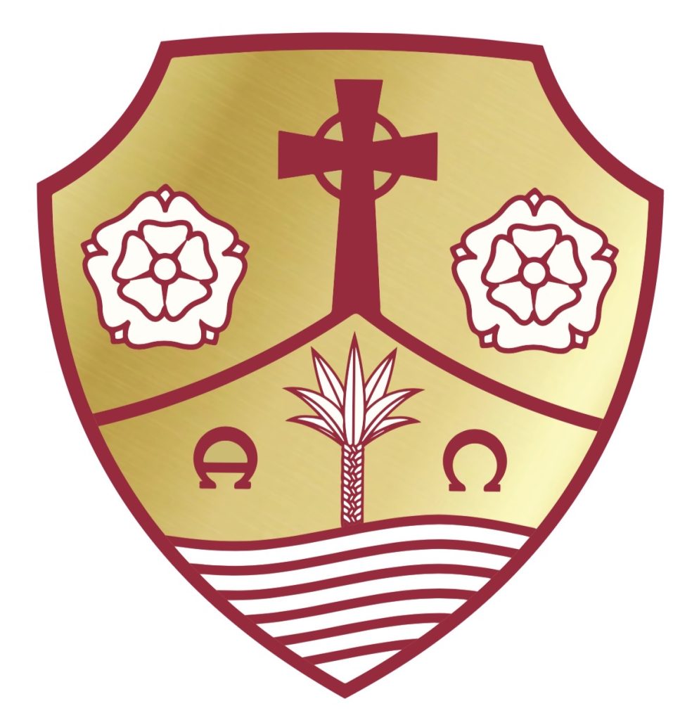
As we embrace a renewed visual identity, we do not leave our history behind. Our parish seal, which has represented Little Flower over the last decade, will remain an important part of our identity. Reimagined in our new red and gold color scheme, the seal will now be reserved for official and formal uses.
Rather than retiring this cherished emblem, we are giving it a more distinguished role, preserving its significance while allowing our new brand marks to carry our identity into everyday parish life.
A PUBLIC WITNESS
Building upon our new dome mark, our full parish logo incorporates our signature wordmark and our founding year to create a complete and versatile expression of our public identity.
Designed for printing and marketing usage, it offers a consistent and recognizable presence wherever our mission takes us.
More than a graphic, it is a witness to who we are: a community of faith, rooted in tradition, united in purpose, and eager to share the beauty of our Catholic faith with the world.
INSPIRED BY THE LITTLE WAY
“In All Things, Great Love and the Glory of God.”
These words capture both the spirit of our patroness, St. Thérèse, and the mission that will guide us into our second century. Inspired by the Little Way of doing ordinary things with extraordinary love, our new motto reminds us that holiness is not reserved for grand gestures alone.
In All Things reminds us that it can also be found in the countless moments of everyday life. Great Love reminds us how we are called to act. The Glory of God reminds us why we do it all.
It is more than just a motto; it is an invitation to make every action, every encounter, and every day an offering of extraordinary love.